
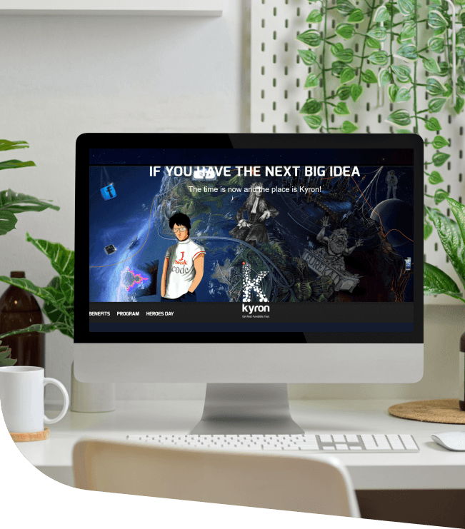
The challenge was to send out the right kind of message and make the prospects understand the concept.
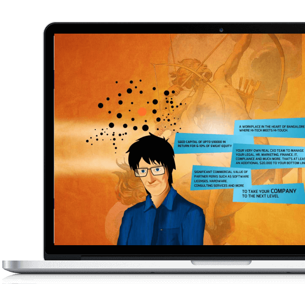
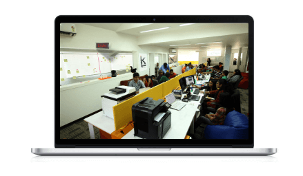
We used a two-pronged approach for the web presence: one sending out the message of the concept of a startup accelerator, and the other with all of the information about the team and the program.
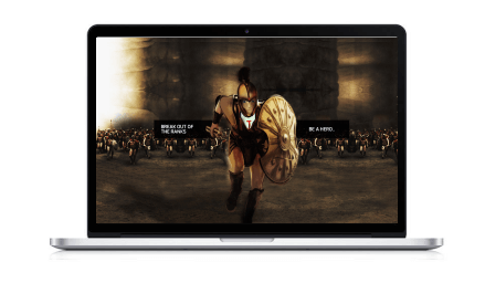
It had a parallax intro section which talked about the concept and the working, as well as a proper site with all the other details. It was pathbreaking back then.
When the user keys in kyron.me, we took them to a storytelling mode, showcasing what is Kyron and what are its benefits?

Awards & Nominations
css design awards, css winner, css reel, css light, best web design award, popular website awards
9000 +
page views within the first month of launch
15000+ Minutes
of time spent by users on the first month of launch
400 entries
for the first program, without any paid advertisement
First
on Google for all relevant keywords