

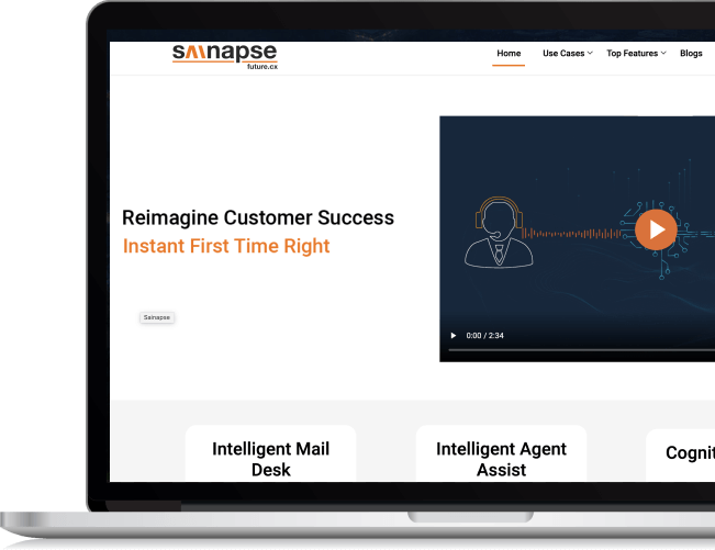
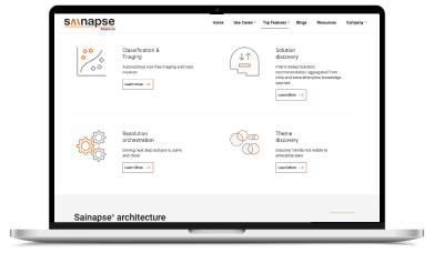
The most important aspect was identifying who the users are and then setting a top goal: structure the site navigation in such a way that visitors can find the information they're looking for with minimal clicks.
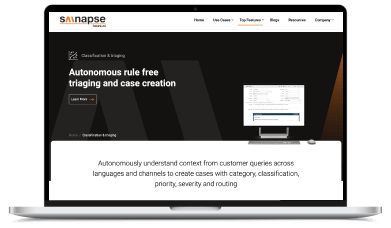
We introduced the main CTA across the site, driving people to the projects section where they could look at stunning photos of Sainapse.ai services in action in order to inspire them for their project.
We wanted to demonstrate sainapse.ai’s ingenuity with an equally innovative site that reinstates the dominance synapse has in the artificial intelligence industry, all while simply and directly presenting the visitor with what they’re looking for.
Our development team used best practices for developing the site on a custom .NET responsive framework. The product structure was unique from a typical product catalog site, which introduced a fun challenge to the architecture.
+672%
Total Session
+168%
Average session duration
-42%
Bounce rate
+120%
Sessions per page
+180%
Organic Search traffic